The 0.4-Second Decision Window
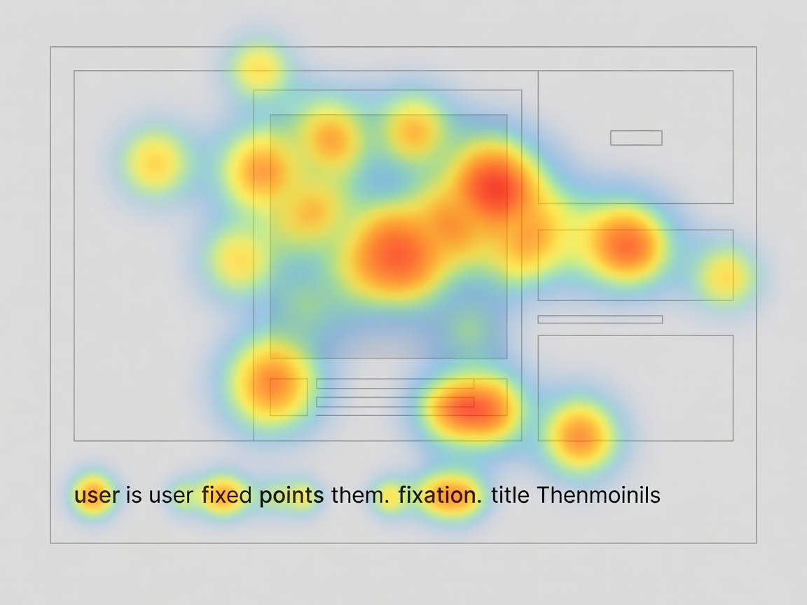
When a user scrolls through the mobile feed or the desktop browse layout, eye-tracking studies indicate they spend between 0.3 and 0.6 seconds assessing a single thumbnail before either committing their gaze or scrolling past. If your visual packaging does not deliver immediate focal clarity, the video is rendered functionally invisible.
Packaging is not graphic design for design's sake; it is communication efficiency under extreme cognitive load. A successful thumbnail does not summarize the entire 18-minute video—it poses a singular, unresolved question that the title validates and intensifies.
The Law of Complementarity (The Anti-Redundancy Principle)
The single most common mistake in amateur channel packaging is text duplication. If the thumbnail says "I Built a Shed" and the title reads "I Built a Shed in 48 Hours," the creator has wasted 50% of their available persuasion canvas.
High-performance packaging treats the thumbnail and title as a two-part punchline:
- Thumbnail Role: Establish emotional context, scale, tension, or impossibility (visual intrigue).
- Title Role: Provide factual context, raise stakes, or specify the boundary conditions (intellectual intrigue).
Complementary Packaging Example
Thumbnail Visual: A cracked concrete foundation with a prominent red inspection notice attached.
Thumbnail Text: "UNSAFE"
Video Title: Why The $400,000 Renovation Just Got Condemned
Notice how neither element duplicates words, yet together they create an irresistible curiosity gap.
Visual Hierarchy and Cognitive Load
Mobile devices account for over 65% of all video consumption on YouTube. A thumbnail displayed on a smartphone screen measures roughly 120mm by 68mm. At this scale, intricate details, subtle shadows, and eight-word sentences collapse into visual static.
1. The Three-Element Rule
A high-performing thumbnail should rarely contain more than three primary visual elements:
- Subject: The person, machine, or central object experiencing or driving the action.
- Focal Contrast Point: The disruption, unexpected element, or evidence of conflict.
- Background/Context: A muted or desaturated environment that provides grounding without competing for attention.
2. Contrast Ratios and Luminance Separation
Thumbnails must visually detach from YouTube's interface, which is predominantly white in light mode and deep gray (#0f0f0f) in dark mode. If your thumbnail features dark, muddy edges with no rim lighting or perimeter contrast, it bleeds directly into the dark mode background, losing its defined boundary.
| Packaging Component | Best Practice Benchmark | Common Failure State |
|---|---|---|
| Text on Thumbnail | 2 to 4 punchy words; bold san-serif; high contrast | 6+ words repeating the video title; decorative scripts |
| Subject Facial Framing | Authentic emotional tension; clearly visible pupils | Exaggerated generic open-mouth scream; artificial cutouts |
| Color Palette | Two dominant colors, one vibrant accent accentuating the focal point | Rainbow clutter; low-contrast pastels that wash out on mobile |
| Title Length | 42 to 55 characters (prevents truncation on mobile screens) | 80+ characters with crucial hook keywords cut off |
A/B Testing Frameworks and Statistical Significance
With the rollout of native thumbnail A/B testing across the YouTube Studio environment, creators can evaluate packaging empirically. However, misinterpreting initial metrics often leads to premature, flawed conclusions.
When testing packaging:
- Isolate One Variable at a Time: Test two distinct thumbnail concepts against the same title before testing title variations. If you change both simultaneously, you cannot attribute the lift.
- Allow Sufficient Sample Size: Never declare a winner after 200 impressions. A statistically sound sample generally requires at least 1,500–3,000 impressions per variant across identical traffic surfaces.
- Examine Watch Time Alongside CTR: If Variant B produces an 8.2% CTR but an average view duration of 3:40, while Variant A produces a 7.1% CTR but an average view duration of 6:15, Variant A generates significantly more total watch time and will sustain long-term algorithmic support.
Curiosity-Driven Packaging
- Broadens reach to cold audiences beyond subscribers.
- Generates higher initial click velocity in Browse.
- Leverages intrinsic human psychological drive to resolve gaps.
Deceptive Clickbait Risks
- Catastrophic retention drop in first 15 seconds.
- Viewer sentiment erosion and negative comment ratios.
- Permanent dampening in algorithmic candidate pools.
Strategic Takeaway
Never treat packaging as an afterthought completed ten minutes before publishing. The highest-performing digital video teams develop their thumbnail and title concepts during the pre-production phase. If an idea cannot be packaged cleanly with three visual elements and a concise title, the video concept itself may lack focus.